Retro vintage in Barcelona
Impressive interior designed by Daniel Pérez and Felipe Araujo from Egue y Seta
Designers: Daniel Pérez and Felipe Araujo from Egue y Seta - www.egueyseta.com Location: Santa Caterina - Borne (Barcelona) Photographers: Víctor Hugo www.vicugo.com and Mauricio Fuertes www.mauriciofuertes.com


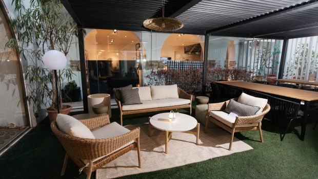
The flat is located in the heart of one of the most trendy and historic neighborhoods of Barcelona but, most importantly it overlooks one of the most traditional, recently renovated, food markets in the city’s centre.
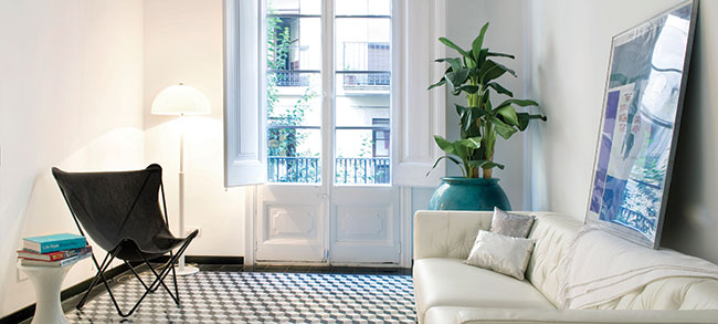
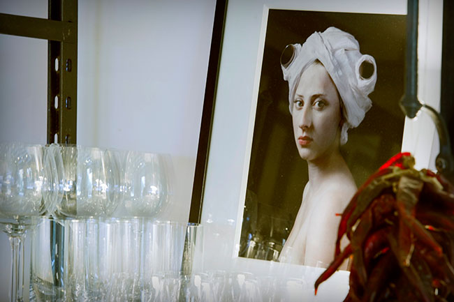
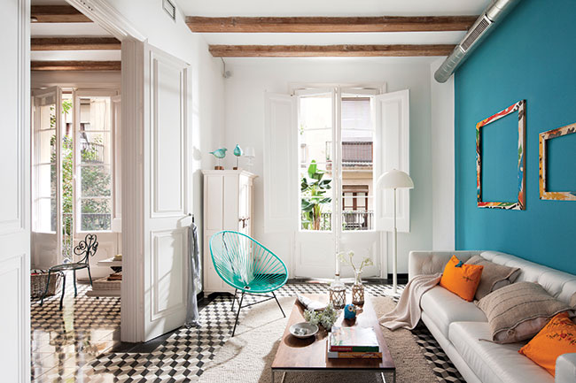
As interior designers, we often find ourselves overwhelmed by the responsibility of selecting every single piece of furniture, fabric, frame, and house ornament the place will display. In this particular case, however, we were pleasantly surprised by the client, and were glad to witness how the house gradually became filled with a wide, eclectic and tasteful selection of objects and pieces bought not only in the market, but from vintage furniture shops, art galleries and local Sunday flee-markets. At a certain stage, we could feel the street and the market had made their way into the living room, giving the place an ‘urban’ atmosphere.
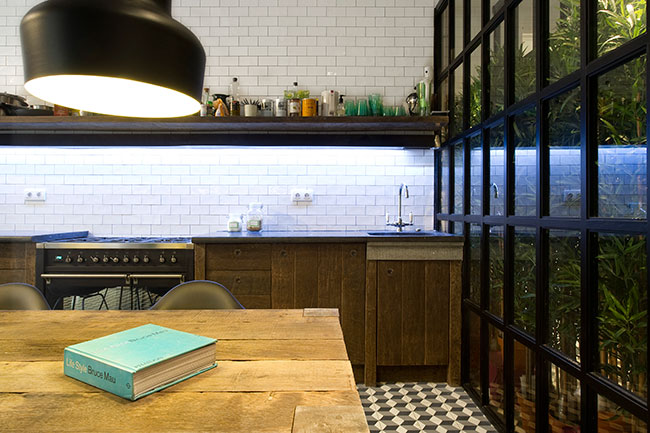
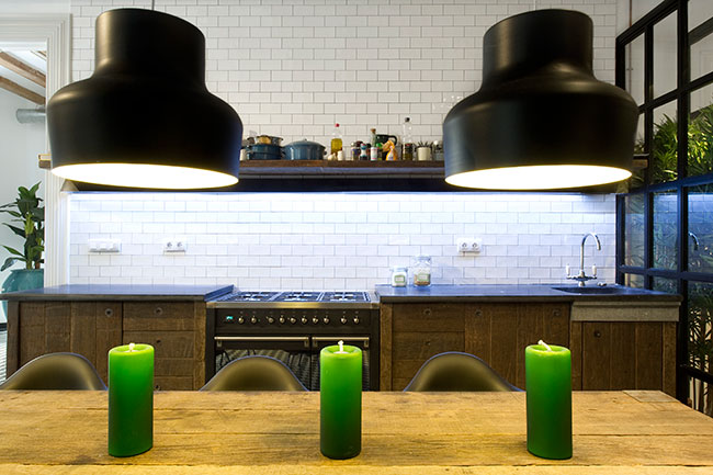
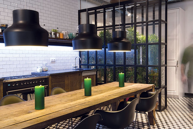
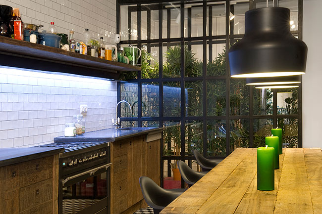
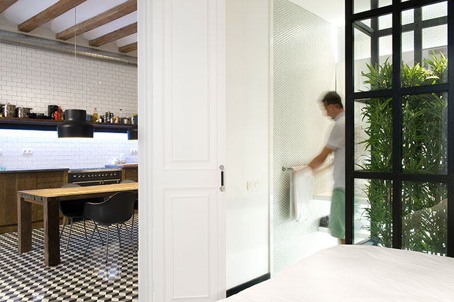
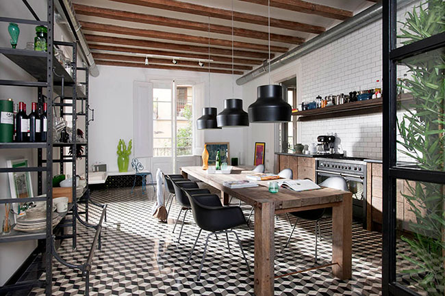
The house was built in 1900 and has the characteristic modernist flavour of the Catalan architecture of the time. As can be easily surmised, lifestyles and habits have changed a lot since then, so changes to the layout proved necessary in order to adapt the house to a more contemporary way of living. Kitchens and toilets are no longer considered dirty service facilities, meant to be concealed from guests and isolated at the back of the house. Instead, in Sta Caterina, the client wanted the kitchen to be the heart and soul of the house, and we responded with a social, multi-purpose, lively open area, where the client and guests can not only cook and eat, but can also work, read, listen to music and even dance.
Though mainly leisure-oriented, this area is much more than just social. It provides storage space, at the same time enabling the circulation between adjacent rooms, avoiding the need for corridors and lobbies.
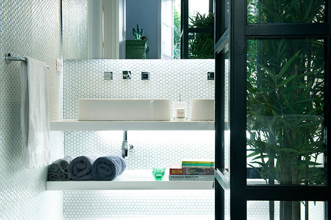
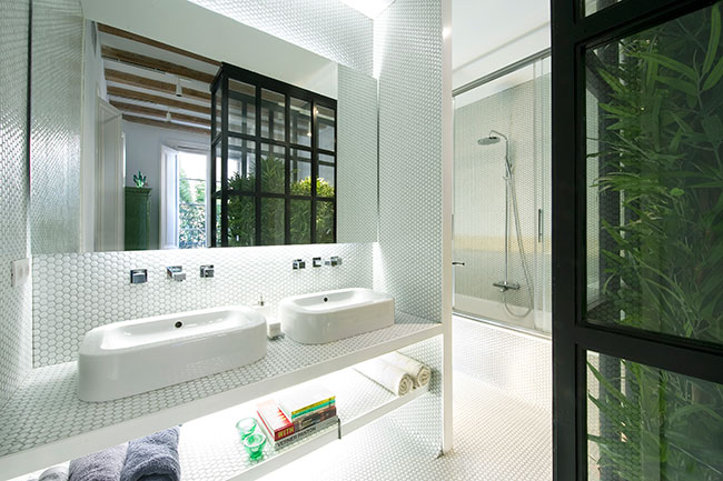
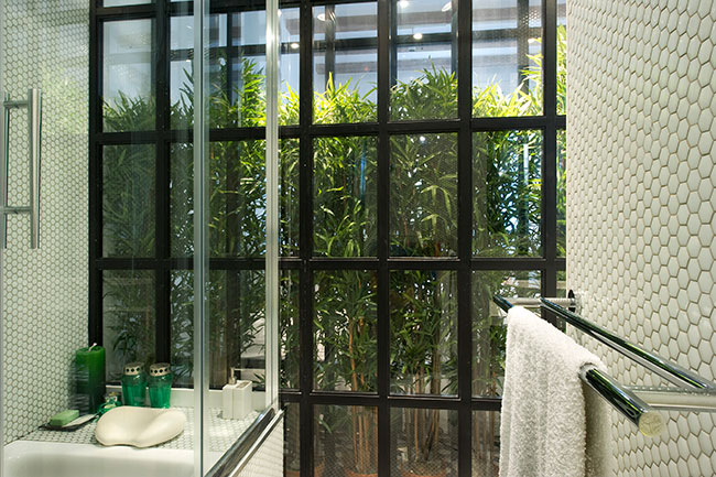
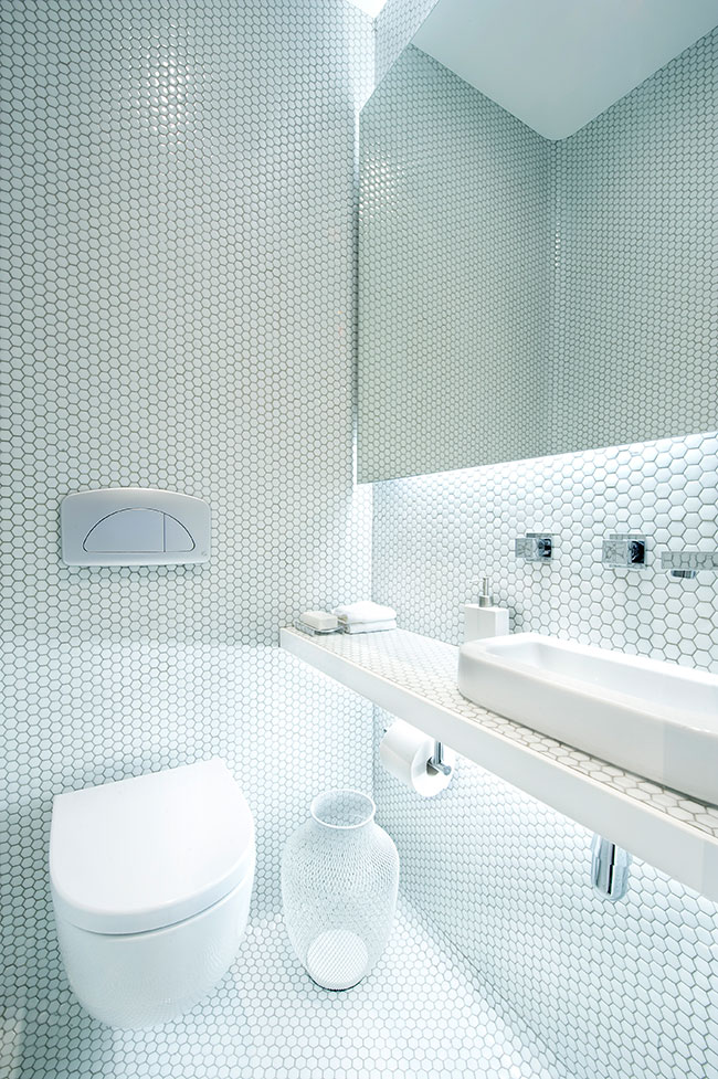
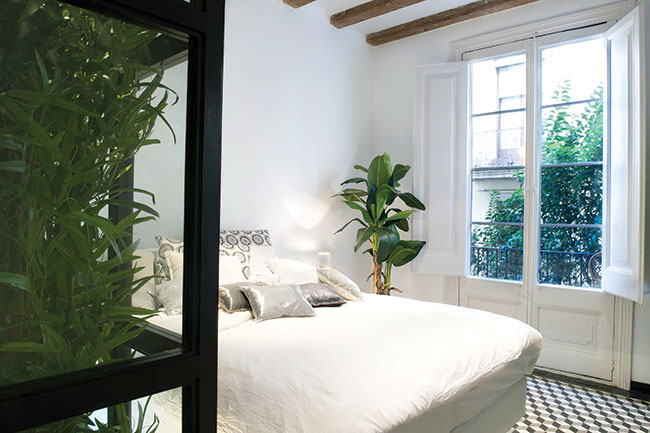
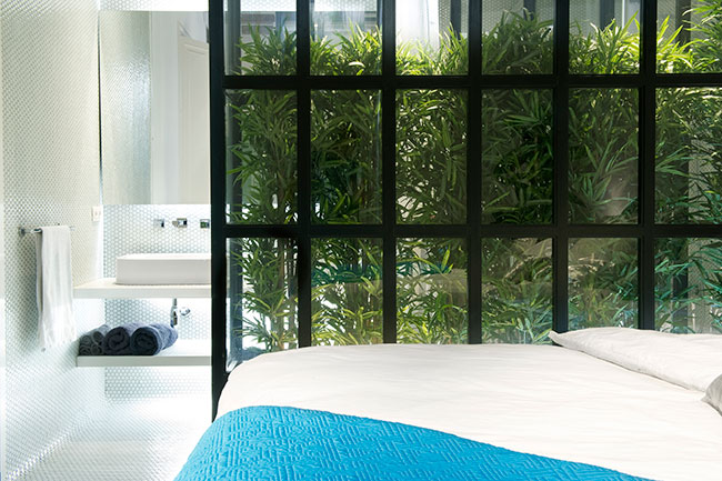
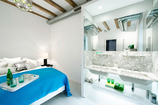
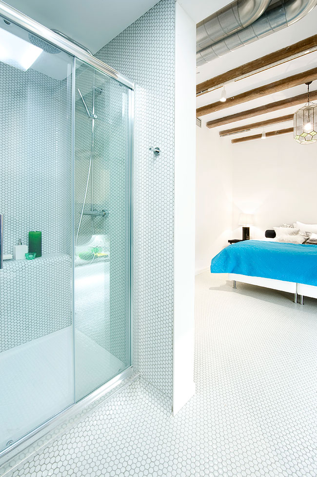
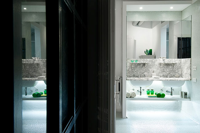
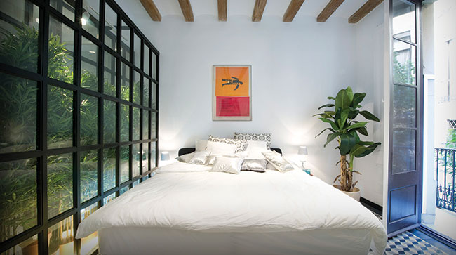
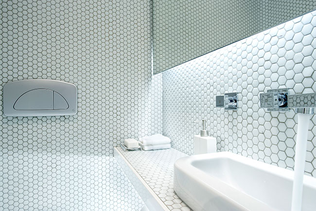
As with the kitchen, the wash rooms were conceived not as sealed, strictly private spaces, but more as areas of pampering and relaxing we preferred these rooms to open on to the bedrooms and offer a much wider perspective of the space which included green “jalousies” made of glass and bamboo leaves for privacy.
Doors separate the social from the private bedroom areas but they are rarely shut. The bathrooms, however, are integrated into the bedroom areas. Together, they are conceived as a private unit, but also as two spaces that do not necessarily need so much isolation from each other. Isn’t it nice to be able to talk to your partner from the bathtub while he or she is gazing at the street lights from the balcony, or reading a book in bed? Isn’t a see-through bamboo leaf curtain a much more sensuous material than a cold, tiled blind wall?
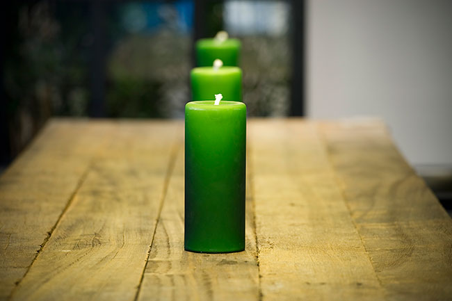
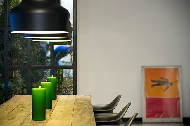
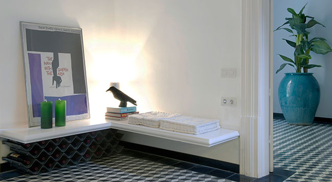
In its original state, the house already suggested a certain style and colour theme. Nevertheless, clients often feel the need to subvert these suggestions. Happily, this was not the case this time, with the client wanting to embrace and preserve everything that could be restored to its original brilliance. Honesty prevailed, with wood looking and feeling like wood. Tiles were laid in the style of the time the building was built. Beams and other architectural elements were left exposed. For colour, we relied on greenery and some very special pieces of decoration (cushions, vases, jars, etc) to pinpoint and give a chromatic accent here and there.
The green box, balcony and inner courtyard are a source of light, colour and visual refreshment. They are vertical gardens and vegetable shutters that compensate for missing walls, lobbies and corridors. They provide the harmony created by a balance of the man-made and the natural.
The result does not look like a page from this season’s furniture catalogue, nor does it smell as if it is brand new. Instead, the different eclectic styles will resist looking dated as the years go by.