The Apthorp
With artistic vision and a love for renovation, 2Michaels let us in on one of their New York residential projects.
These images will inspire any new homeowners with a passion for an eclectic mix of both art and comfort.
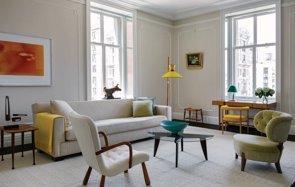
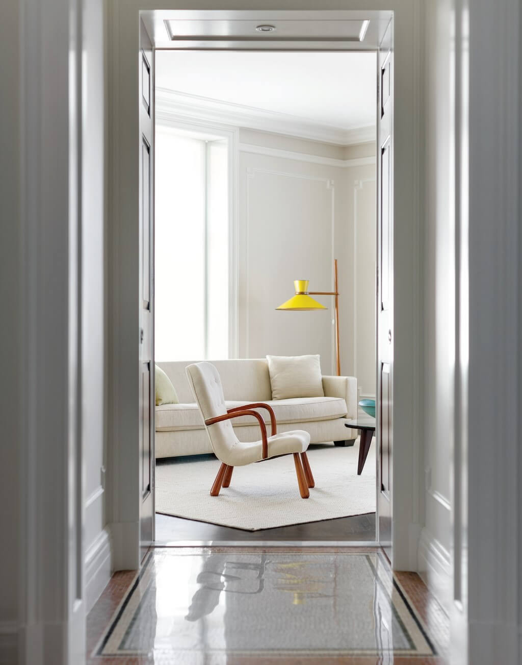
When it comes to dream places for a Manhattan pied-à-terre, The Apthorp probably sits high on many people’s lists. It certainly did for the Las Vegas-based clients of Joan and Jayne Michaels, the design sisterhood formally known as 2Michaels. The husband, a professional poker player, grew up in Gotham; for him, Clinton & Russell’s landmark early 20th-century Italian Renaissance Revival pile held a long-time marker in the wish-fulfillment department. The wife, a trained nurse, felt similar about the place, and loved the neoclassical quality of its expansive, high-ceilinged rooms.
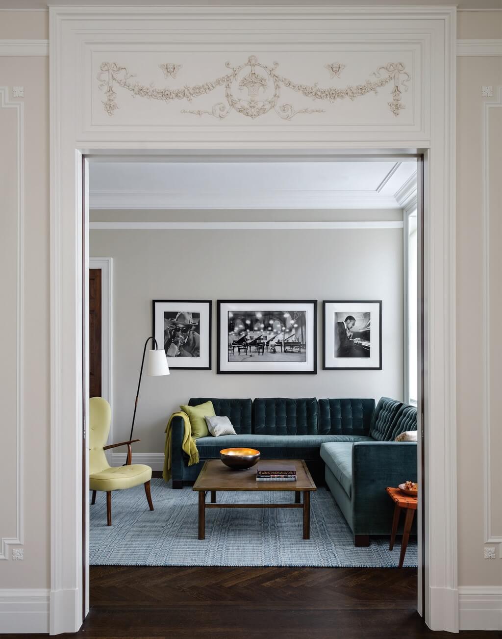
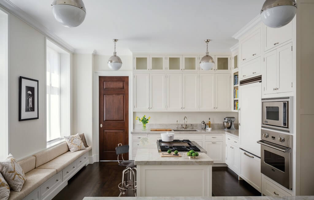
First came a sensitive, soup-to-nuts renovation of the three-bedroom, 4,000-square-foot interior. Architect Scott Ageloff tweaked the plan to create more entertaining and living space, redid the kitchen, overhauled the bathrooms, and more. “Virtually everything you see is new, including all the finishes,” he says. “We pared back the detail for restraint, but all the plasterwork matches the original, as we wanted to respect the history of the building.”
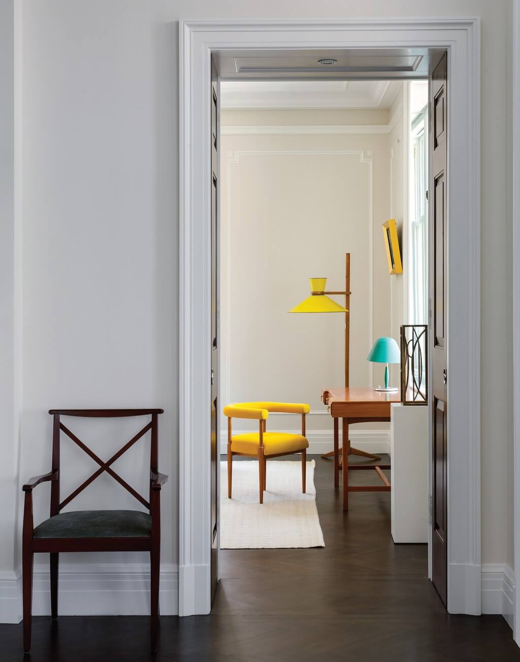
As the couple struggled with furnishings, they turned to the Michaels sisters. Joan says, “both of them liked how we use antiques and that we have slightly quirky taste.” The first piece that the designers selected—the living room’s Jacques Hauville-designed yellow floor lamp from the 1950s—was an inspiration for everything that followed. The sisters and their clients decided to concentrate on a European look; to source as much as possible from Europe, specifically from Scandinavia, northern Europe, Austria, and Germany; and to keep the rooms spare and the upholstery forms soft. As the Michaels introduced their clients to looking at antiques and the ins-and-outs of the auction experience, the couple took to the process like naturals—and began obsessing over pieces – finding the right ones for the environment along with their designers.
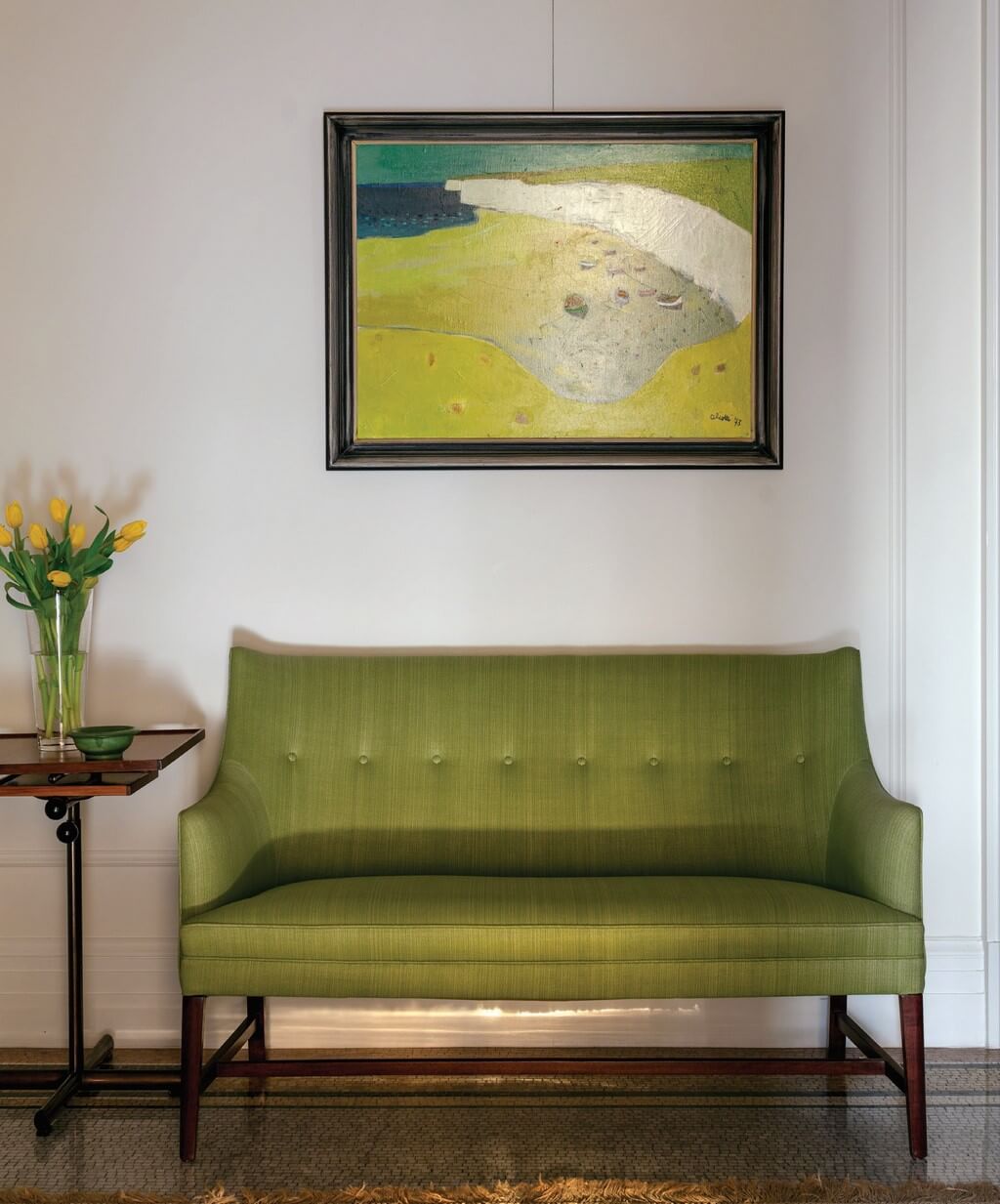
Early in the project, Jayne says, “when we were looking at books on northern Europe and thinking about compositions, we gravitated toward Vermeer because of his colours, the way he arranged the interiors he painted, and his filtered light.” The influence of the Dutch painter’s eye is discernible in the choice of silhouettes, furniture placement and table-top arrangements, palette selections, and the overall timeless feeling of the rooms. As the gamble of decoration goes, that’s taking the hand you’re dealt and playing the cards right.


